LOST STUDENTS, LOST SALES: HOW UX SAVED EXAMREVISION.IE
LOST STUDENTS, LOST SALES: HOW UX SAVED EXAMREVISION.IE
UX/UI Design
UX/UI Design

Project Overview
Project Overview
Team of 2 UX Designers | Project: 1 Month
Research - Interview - Define Problem - Sketch - Prototype - Test - Iterate
Team of 2 UX Designers | Project: 1 Month
Research - Interview - Define Problem - Sketch - Prototype - Test - Iterate
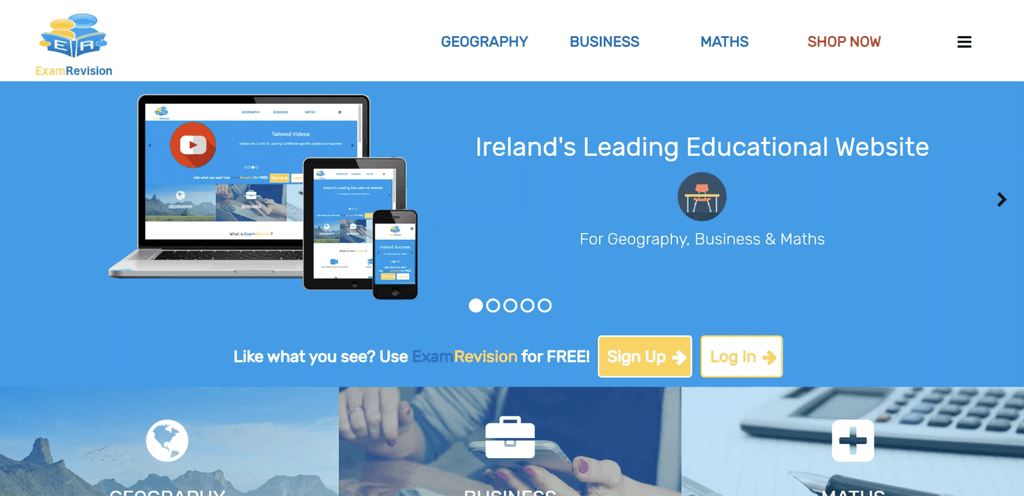
Imagine struggling to find the perfect study resource, then landing on a website so confusing you just leave. That's what students faced with ExamRevision.ie, a promising Irish EdTech platform. High bounce rates, low engagement, and zero online sales painted a grim picture. Trust was low – the user experience was clunky, and pricing a mystery until after signup.
Imagine struggling to find the perfect study resource, then landing on a website so confusing you just leave. That's what students faced with ExamRevision.ie, a promising Irish EdTech platform. High bounce rates, low engagement, and zero online sales painted a grim picture. Trust was low – the user experience was clunky, and pricing a mystery until after signup.
But what if I told you we transformed ExamRevision.ie?
But what if I told you we transformed ExamRevision.ie?
In this case study, we'll delve into the UX redesign that brought students back, boosted engagement, and turned things around. That resulted in a surge in student engagement, a whopping 5,000 sales in just 2 months, and 4 entire schools signing up – representing hundreds of new students!
In this case study, we'll delve into the UX redesign that brought students back, boosted engagement, and turned things around. That resulted in a surge in student engagement, a whopping 5,000 sales in just 2 months, and 4 entire schools signing up – representing hundreds of new students!
Requirement
Requirement
ExamRevision.ie knew their website wasn't performing. Sales were stagnant, and user engagement was low. They needed a solution – fast. With the back-to-school season approaching (a crucial time for EdTech platforms), they had a tight deadline: optimise and clarify the sign-up process within a single month.
ExamRevision.ie knew their website wasn't performing. Sales were stagnant, and user engagement was low. They needed a solution – fast. With the back-to-school season approaching (a crucial time for EdTech platforms), they had a tight deadline: optimise and clarify the sign-up process within a single month.
Problem
Problem
New learning platform ExamRevision.ie struggles with sign-ups due to unclear website navigation and hidden pricing. This frustrates students and teachers, hindering user acquisition and threatening the platform's foothold in the competitive Irish education market.
New learning platform ExamRevision.ie struggles with sign-ups due to unclear website navigation and hidden pricing. This frustrates students and teachers, hindering user acquisition and threatening the platform's foothold in the competitive Irish education market.
Solution
Solution
A data-driven UX overhaul will transform ExamRevision.ie. Users will experience a website that's intuitive and transparent, with upfront pricing and responsive customer support fostering trust. This streamlined approach will optimise the signup process, boosting user acquisition and engagement for ExamRevision.ie in the Irish market.
A data-driven UX overhaul will transform ExamRevision.ie. Users will experience a website that's intuitive and transparent, with upfront pricing and responsive customer support fostering trust. This streamlined approach will optimise the signup process, boosting user acquisition and engagement for ExamRevision.ie in the Irish market.
My Process
My Process
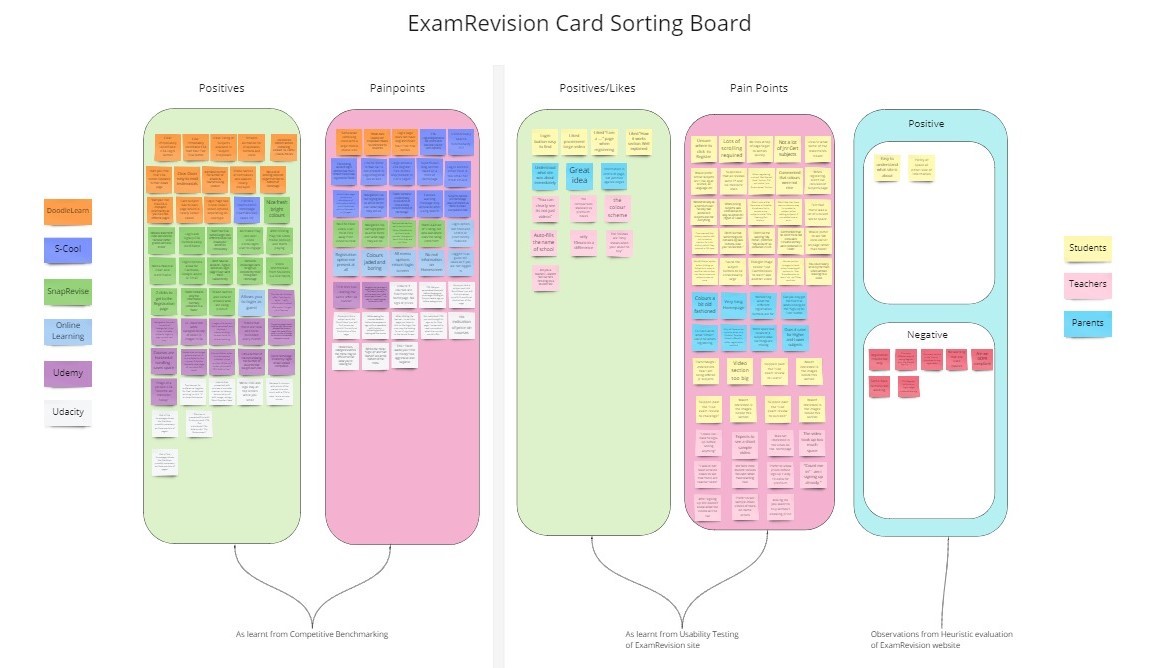
Competitor Analysis: We analysed 5 key competitors (Irish & global platforms) to understand industry best practices.
User Research: Remote usability tests with teachers (2) and students (3) via Zoom identified core user pain points.
Problem Definition: Gathered findings were synthesized to pinpoint three critical issues: unclear value proposition, awkward signup process, and hidden pricing.
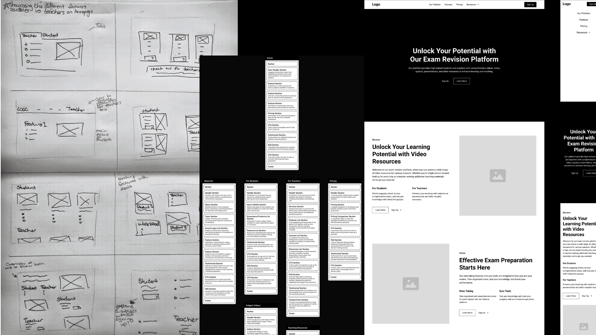
Information Architecture: A user flow and sitemap were meticulously crafted to lay the groundwork for a smooth user journey.
Rapid Prototyping: "Crazy 8s" sketching sessions facilitated rapid solution ideation.
Usability Testing: A mid-fidelity prototype built in Figma was tested with the same user group, leading to iterative refinement.
High-Fidelity Prototype & Handover: The final stage involved the development of a high-fidelity prototype complete with annotations, ensuring a seamless handoff to the web developer.
Competitor Analysis: We analysed 5 key competitors (Irish & global platforms) to understand industry best practices.
User Research: Remote usability tests with teachers (2) and students (3) via Zoom identified core user pain points.
Problem Definition: Gathered findings were synthesized to pinpoint three critical issues: unclear value proposition, cumbersome signup process, and hidden pricing.
Information Architecture: A user flow and sitemap were meticulously crafted to lay the groundwork for a smooth user journey.
Rapid Prototyping: "Crazy 8s" sketching sessions facilitated rapid solution ideation.
Usability Testing: A mid-fidelity prototype built in Figma was tested with the same user group, leading to iterative refinement.
High-Fidelity Prototype & Handover: The final stage involved the development of a high-fidelity prototype complete with annotations, ensuring a seamless handoff to the web developer.
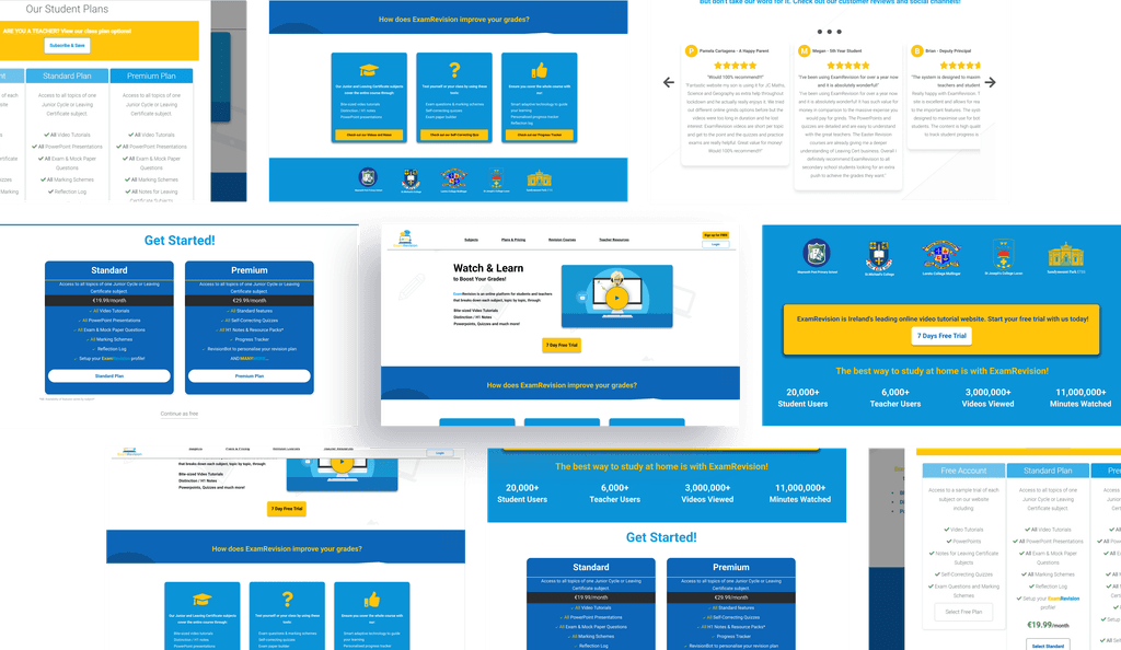
The Result
The Result
Standard and Premium Plan sign up rates increased by 41% within 3 months of website improvements being implemented.
Sign ups to online Revision Courses increased by 98%.
Data on Google Analytics showed that bounce rates have significantly improved.
Standard and Premium Plan sign up rates increased by 41% within 3 months of website improvements being implemented.
Sign ups to online Revision Courses increased by 98%.
Data on Google Analytics showed that bounce rates have significantly improved.
View Live Website
My Learnings & Next Steps
Challenge:
Tight deadlines pushed my time management skills. Uizard became my secret weapon, streamlining prototyping and allowing rapid iteration. This focus on efficiency ensured deadlines were met, while fostering continuous improvement with each new prototype.
What I would have done differently:
In hindsight, deeper research would have been invaluable. Interviews with five students and teachers each would have enriched the understanding of user needs. Discovering Mobbin.com offered a wealth of UI inspiration, which, with more time, could have further elevated the final design.
Next Steps:
This project's journey continues! Constant refinements of various stages and user profiles are ongoing. But that's not all! I'm thrilled to be taking on the design of the app for this up-and-coming EdTech platform. Watch this space!
My Learnings & Next Steps
Challenge:
Tight deadlines pushed my time management skills. Uizard became my secret weapon, streamlining prototyping and allowing rapid iteration. This focus on efficiency ensured deadlines were met, while fostering continuous improvement with each new prototype.
What I would have done differently:
In hindsight, deeper research would have been invaluable. Interviews with five students and teachers each would have enriched the understanding of user needs. Discovering Mobbin.com offered a wealth of UI inspiration, which, with more time, could have further elevated the final design.
Next Steps:
This project's journey continues! Constant refinements of various stages and user profiles are ongoing. But that's not all! I'm thrilled to be taking on the design of the app for this up-and-coming EdTech platform. Watch this space!
Want to work together?
Want to work together?
Feel free to reach out at
Feel free to reach out at